Best Practices for Website Design – UX, Speed & Accessibility
In 2026, best practices for website design are going beyond aesthetics to deliver a website that is not just visually good but also accessible, responsive, and user-centric.
Because 94% of people form an impression of a website by its design.
Therefore, the best practices for user-friendly website design are not just technical checklists. Rather, they are principles rooted in psychology, behavior, and human experience.
Because a good design communicates, it doesn’t decorate.
In this article, we have provided a comprehensive guide on the best practices for designing a user-friendly website
Let’s dive in!
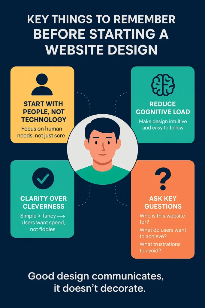
Key Things To Remember Before Starting A Website Design
- Start with people, not technology.
- Design for people, not screens
- Reduce cognitive load
- Clarity over cleverness
When people read website design, they instantly jump to typography, color scheme, and CTA. But in reality, design is not about how something looks. It is about how it works for people.
A designer must answer these questions before designing a website
- Who is this website for?
- What do users want to accomplish using this website?
- What frustrations do users face elsewhere that you can avoid?
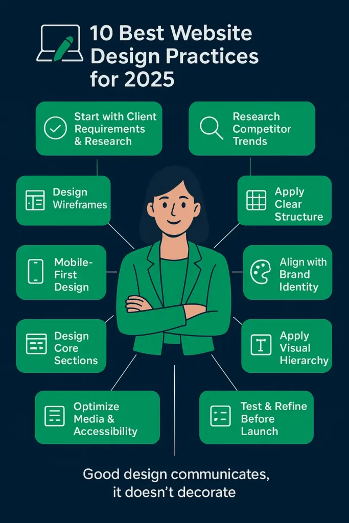
Best Practices For A Website Design – Key Elements Guideline
- Start with client requirements and research
- Build wireframes (Low, Mid, High fidelity)
- Search SERP for competitors’ designs, look at what’s working
- Focus on mobile-first design
- Apply a clear CTA’s structure
- Align with brand identity
- Design core website sections thoughtfully
- Apply visual hierarchy and readability
- Optimize media and accessibility
- Test and refine before launch
1. Start With Client Requirements And Research
Every great website begins with understanding the client’s goals and audience. Without this foundation, even the best-looking design can miss the mark.
Best Practices:
- Ask detailed questions about business goals, target audience, and design inspirations.
- Conduct R&D based on user psychology and design principles
- Collect brand assets (fonts, style guides, logo and color codes) early.
Expert guide: Ask for the requirements in documents or PDF format to ensure both designer and client share the same page.
2. Look What’s Trending
Design always hits when it is niche-specific. You can not apply restaurant website ideas to healthcare website designs. So, always design according to niche and business needs.
Best Practices:
- Review 3–5 competitor websites.
- Note their layout, design elements, and user flow, and you will get the trend.
- Identify opportunities for differentiation while following proven patterns.
3. Design Wireframes (low, mid, and high)
Your website wireframe is the same as the bone structure of the body. They help visualize the structure before investing time in detailed designs.
Best Practices:
- Low Fidelity: Simple sketches to define layout and flow.
- Mid Fidelity: Add structure to show how elements will interact.
- High Fidelity: Detailed, polished wireframes close to the final design.

Note: Share the wireframe with clients and ask for approval. Further, you can also read how to create a wireframe
4. Apply a Clear Structure
A clean, inclusive structure makes a website intuitive and easy to navigate. One that will engage and convert, achieving the real goals of business.
Best Practices:
- Use a grid-based layout for alignment and balance.
- Keep the main navigation under seven items.
- Use website outlines to make navigation easy.
- Place key CTAs above the fold.
- Add breadcrumbs for orientation.

Note: The less the visitor has to think about how to use your site, the more they can focus on why they are there.
5. Focus Mobile-First Design
Best practices for mobile website design involve designing a website that is easy to navigate, can be optimized better, has readable fonts, and performs smoothly across all types of mobile devices.
Almost 60% of website traffic comes from mobile users. Here, designing for smaller screens first is critical.
This is a point to be mentioned as several desktop websites’ design broke when run on mobile devices.
However, modern WordPress is working to remove design barriers for devices, yet this remains of the utmost importance.
Best Practices:
- Buttons should be 44px and touchable.
- Make sure fonts do not blur when zooming in.
- Test layouts on multiple devices and screen orientations.
Pro tip:
Make mobile design first and desktop design later, or design separate versions for mobile devices and desktop UI.
6. Align With Brand Identity
Brands maintain consistency with design elements across all the screens they appear. And exactly here, custom development takes on the template-designed websites.
You are bound to a template idea in using another template; however, in custom design, you have complete freedom.
Best Practices:
- Stick to 2–3 primary brand colors with accent shades.
- The font should be the same throughout.
- Incorporate brand tone and messaging across content and visuals.
Explore custom website design and development service
7. Design Core Website Sections Thoughtfully
While every niche is different, some sections are essential for most websites. All these sections are equally important from the CRO point of view.
Typical Sections Include:
- Hero Section: Hero heading, banner image, and main CTA.
- About Section: Who you are and why you matter
- Services/Products: Clear breakdown of offerings.
- Testimonials/Case Studies: Build trust with social proof.
- Call-to-Action Blocks: Throughout the site, not just at the end.
- Footer & Header: Navigation, contact, and quick links.
8. Apply Visual Hierarchy and Readability
Guide users’ eyes to what matters most. The hero section, brand message, or point of interest. There must be something that instantly grabs attention because a good website engages users in under 0.5 seconds.
Best Practices:
- Use large, bold headlines for key messages.
- Maintain font size (16px or larger) and line spacing.
- Limit sections to one or two main focal points.
9. Optimize Media and Accessibility
Performance and accessibility go hand-in-hand.
Best Practices:
- Compress images (WebP/AVIF formats).
- Maintain contrast ratios of 4.5:1 or higher.
- Add alt text and keyboard navigation.
- Keep animations purposeful and under 300ms.
10. Test and Refine Before Launch
No design is complete without testing. Always test the website in the staging environment to ensure it runs well when going live.
Best Practices:
- Test across browsers and devices.
- Run speed and accessibility audits.
- Check for broken links and usability issues.
- Use A/B testing and heatmaps post-launch for ongoing optimization.
Website Design Tips For Professionals
Effective websites aren’t always flashiest. Follow these website design tips to stand out.
- Prioritize speed
- Keep navigation simple
- USE effective CTA’s
- Design mobile first
- Stay consistent with branding

Professional Web Design Principles
The website design principles for a professional website are proven guidelines or SOPS for a functional, user-centric website that aligns with business goals. These guidelines are
- Clarity over cleverness: Users shouldn’t have to guess what you offer.
- Accessibility: Every website should be inclusive, with alt text, high-contrast colors, and keyboard navigation for all users.
- Consistency: From your homepage to your footer, design elements should create a seamless experience.
- User-centric approach: Good design solves problems. Always ask, what do my visitors want to accomplish here?
Conclusion
Wrapping up, we have listed the best practices for website design. Follow them and design a website that requires no more repetition after the final version.
Remember, if you design a typical website or poorly structure a website, you are providing your competitors a chance to outrank you.
That’s why investing in professional website design and development isn’t an expense; it’s a business-critical decision.
Here we can help in
- Design and development of a website from scratch. (your idea into a live website)
- Redesign consultation for the website or to integrate a new feature into your website.
- Content creation and SEO
Get in touch! Let’s design your professional website.
FAQS
What are the best web design practices for mobile-first websites?
Design a website that is easy to navigate, can be optimized better, has readable fonts, and performs smoothly across all types of mobile devices.
What are the best practices for designing a website?
Best practice for website design includes designing for users with proper visual structure, strong and effective CTA’s, readability should be good, can be optimized for SEO and is mobile friendly. Best website designs always outperforms on UI/UX scale
What are website design tips for small businesses
Small business should always focus on their growing audience and their tight budget. They can get a good website design, ensuring all right web design tips.
What are the best practices for WooCommerce website design?
The best practice for a WooCommerce website design is to optimize for speed and mobile, design product catalogue simple, make checkout process easy and create a clear hierarchy
Popular Guides
View All Guides