10 Best Financial Services Website Design for Inspiration
A financial services website is often the first place a client goes to evaluate whether they can trust you with their money.
Unlike other industries, where design trends can be playful or experimental, finance requires a careful balance: professional, clear, and reliable, while still engaging enough to keep people exploring.
The best websites in this sector prove that design doesn’t need to be dry. They combine usability with credibility, and subtle creativity with structure.
Below, we explore ten excellent examples that show how financial firms of different sizes, from fintech startups to local advisory practices can build digital experiences that inspire confidence and attract clients.
1. Betterment
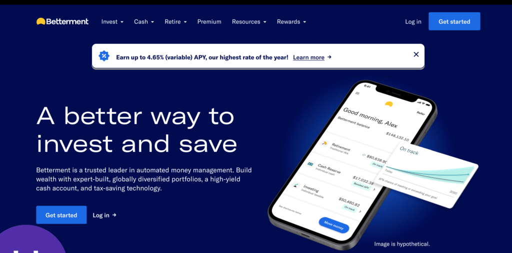
Betterment is one of the most recognizable fintech brands, and its website is a masterclass in clarity. The homepage opens with a simple proposition: invest better with automated tools that simplify wealth management.
The typography is modern but approachable, and the color palette leans into blues and greens that suggest security without being dull.
What sets Betterment apart is how it communicates complex concepts in digestible ways. Graphs and visual aids show performance trends, while calls to action are always within reach, whether you want to open an account or learn more about retirement planning. It’s a lesson in making finance less intimidating through design.
2. Vanguard
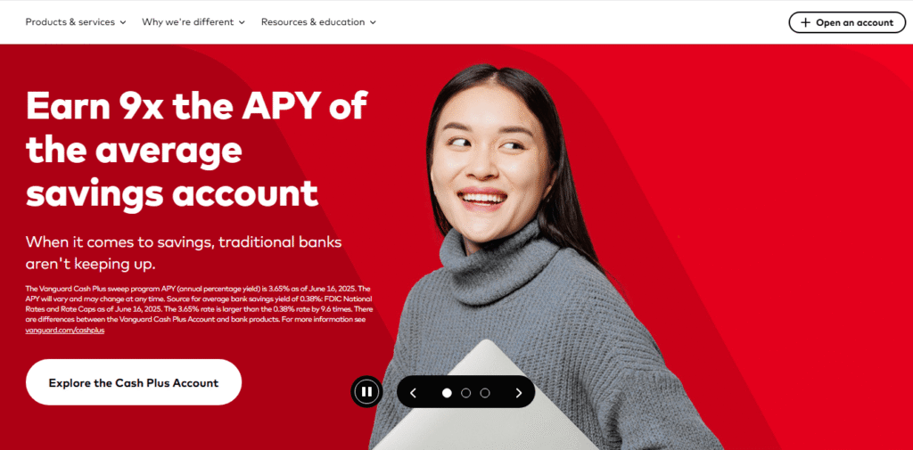
Vanguard’s site reflects the reputation of a long-established institution. There’s no gimmick here—just structured navigation, conservative use of imagery, and concise copy.
The site’s strength lies in its focus on resources. Investors can quickly find market insights, calculators, and research without wading through heavy sales messaging.
For financial firms that don’t need to look trendy but want to emphasize reliability, Vanguard is proof that restraint can be powerful.
3. Wealthfront
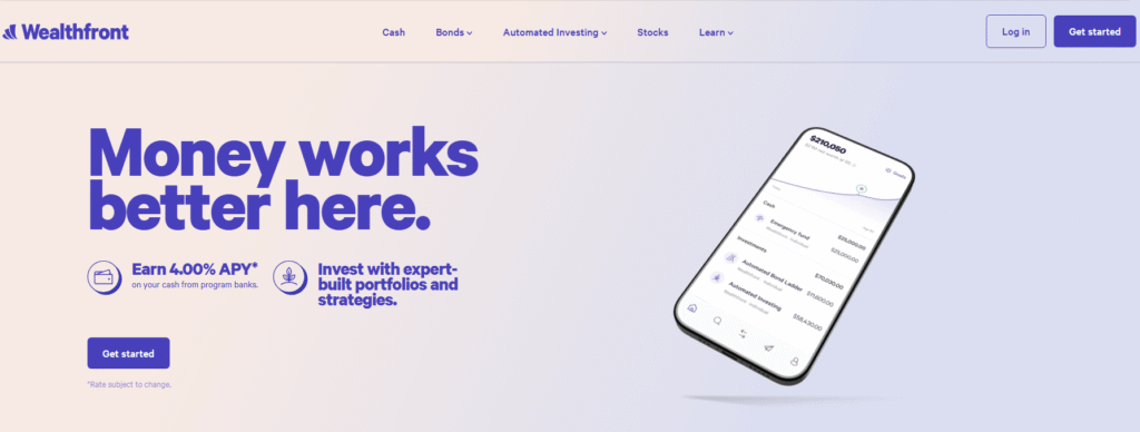
Wealthfront takes a different approach, appealing to younger professionals who want modern, digital-first financial management.
Its design feels fresh: clean whitespace, conversational copy, and modules that explain financial planning step by step.
Instead of simply listing services, Wealthfront guides visitors through scenarios, showing how its technology fits into their life goals.
This style makes the site feel more like a digital product than a static brochure, which is a smart move for a brand targeting tech-savvy clients.
4. Heighten Accountants
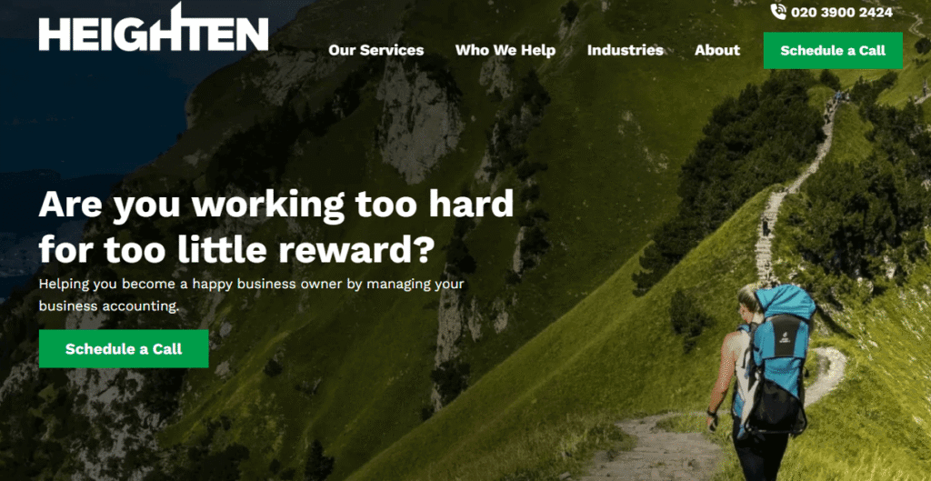
Heighten Accountants, based in the UK, demonstrates how a smaller practice can use design to position itself alongside much larger competitors.
The homepage is segmented into clear service pathways: “Services,” “Who We Help,” and “Industries.” This makes it easy for visitors to self-identify and move directly to content that applies to them.
Conversion opportunities are handled intelligently. Prompts such as “Schedule a Call” or “Quick Quote” are integrated naturally into the design, so users never feel pressured, but they’re always invited to take the next step.
Combined with professional branding and consistent use of imagery, the site shows how accountants can use digital design to project confidence and approachability.
5. Randall Wealth Group

Randall Wealth Group focuses on personalized wealth management, and the website reflects that emphasis. Rather than overwhelming visitors with jargon, the design highlights advisor profiles, service breakdowns, and a clear description of what working with the firm involves.
The photography and color scheme feel intentionally professional but not sterile, which is crucial for wealth advisors.
By positioning the human side of the practice upfront, the site reassures potential clients that financial advice here isn’t just transactional, it’s relational.
6. Mortgage Minds
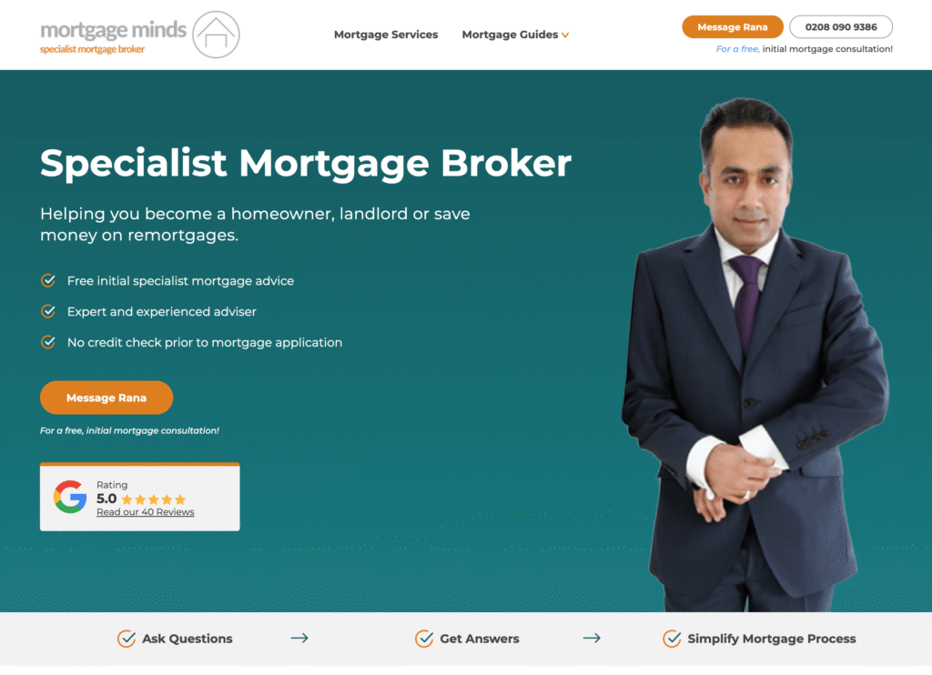
Buying a home is one of the most stressful financial decisions people face, and Mortgage Minds acknowledges that with a design that feels both personal and practical.
Right at the top, visitors see the offer of a free initial mortgage consultation, an important reassurance for first-time buyers.
The founder’s portrait adds warmth and personality, while solid content calm anxieties. This mix of trust-building content and straightforward calls to action makes the site an excellent example for small firms that need to connect with clients on an emotional level.
7. Carson Wealth
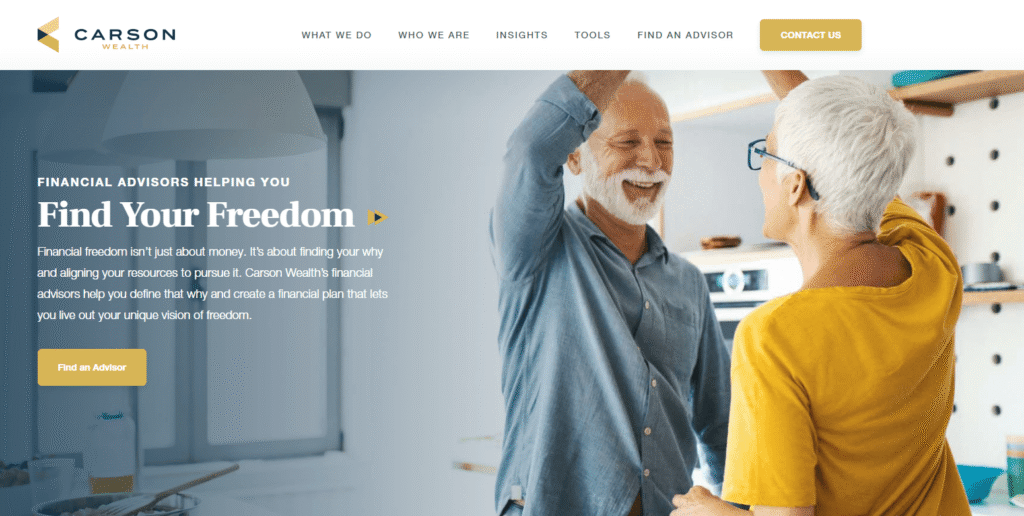
Carson Wealth positions itself differently by emphasizing aspiration. The copy “Helping You Find Your Freedom” sets the tone, and the design supports it with photography that shows clients in real-life scenarios rather than generic stock imagery.
The site’s branding feels contemporary, but not flashy. Combined with thoughtful content and straightforward CTAs, it blends professional authority with a message of personal empowerment.
This approach shows how financial advisors can compete by leaning into storytelling rather than product descriptions.
8. Sight Banking
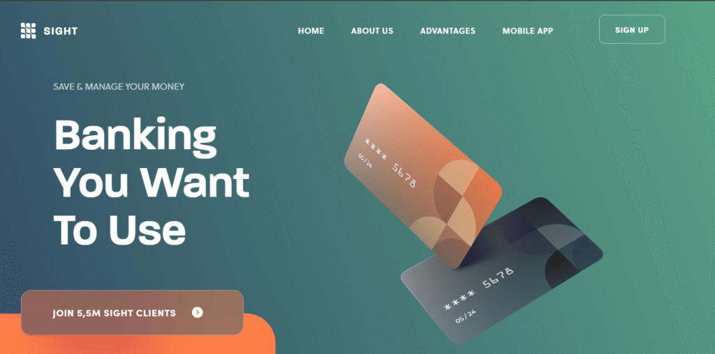
Sight Banking breaks the mold of traditional financial layouts by using curved sections, bold contrasts, and dynamic scrolling. It’s a striking design that still manages to keep the structure practical, with important CTAs always in the right places.
The design proves that even conservative industries can adopt modern aesthetics without losing credibility. Done well, as in this case, a touch of creativity can help a brand stand out in a crowded market.
9. Wealth Hub Australia
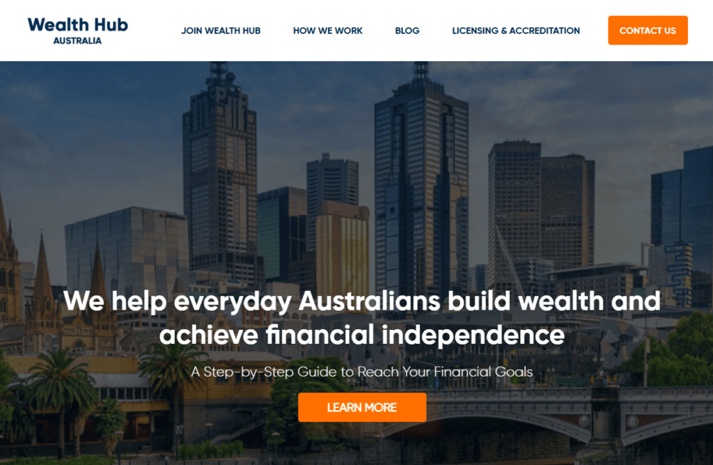
Wealth Hub demonstrates the power of giving value upfront. Its website integrates interactive tools like investment calculators and planning dashboards. Instead of passively presenting information, it engages visitors by letting them experiment and visualize scenarios.
This kind of interactivity increases trust because users feel like they’re already benefiting from the company before making a formal commitment. For firms that want to keep visitors on their site longer, tools like these are invaluable.
10. Morgan Stanley
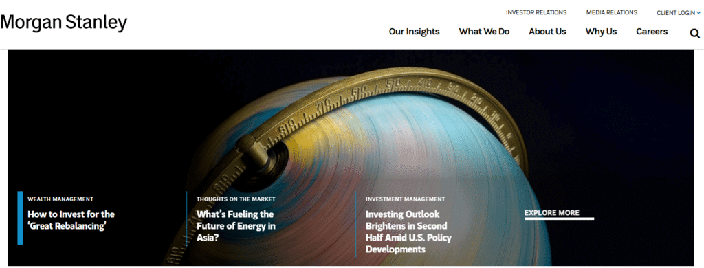
Morgan Stanley’s website shows how a large global brand can present a clean, user-friendly experience without diluting its authority. The mega menu is well structured, separating content for investors, businesses, and institutions.
News and insights are prominently displayed, reflecting the firm’s thought leadership.
The design relies heavily on whitespace and clear typography, creating a calm experience despite the depth of content. For institutions with multiple audience types, Morgan Stanley offers a strong model of how to balance complexity with clarity.
Key Lessons from These Examples
Looking across these ten sites, several lessons emerge:
- Clarity wins: Simple navigation and direct copy make finance approachable.
- Trust is visual: Testimonials, professional photography, and consistent branding all signal reliability.
- Value creates engagement: Interactive calculators and resources keep users involved.
- Emotion matters: Even in finance, human touches like portraits and relatable language build stronger connections.
- Balance is everything: Creativity can be used, but it must support—not overshadow—the core message of stability.
Conclusion
A financial services website is more than a digital brochure. It is often the deciding factor in whether a potential client chooses to contact you. The best designs show that professionalism doesn’t have to mean dull.
By combining clarity, trust signals, and thoughtful design details, firms of any size can build websites that not only attract visitors but also convert them into lasting clients.
If your firm is ready to move beyond generic templates and create a site that communicates both credibility and connection, it’s worth investing in design that speaks directly to your audience.
Explore professional website development for accountants and firms and request a free quote today.
Have other questions? Schedule a quick strategy call.