Website Navigation Structure: What Every Business Should Include
A visitor should be able to land on your website and immediately understand three things:
- What do you do?
- Where should they go next?
- How to contact you?
If they have to think about it, your website navigation structure is already creating friction.
Many businesses focus heavily on colors, animations, and design trends while overlooking one of the most important parts of their website navigation.
A well-planned website navigation structure helps visitors move through your website naturally. It guides them toward important pages, makes information easier to find, and increases the chances of conversion. It also helps search engines understand how your website is organized. Research consistently shows that simple, logical navigation improves usability and helps users find information faster.
The best website navigation structures are usually the simplest ones.
Instead of overwhelming visitors with dozens of menu options, successful business websites focus on clear pathways, organized dropdowns, and one primary call-to-action that stands out across the entire site. Navigation should support user goals, not create extra decisions.
Read More: 10 Best Small Business Website Design Ideas
What Should a Website Navigation Structure Include?
Every business website is different, but most high-performing websites share a few common navigation principles.
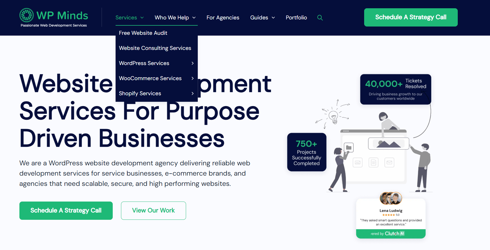
A Simple Primary Navigation Menu
Your main navigation should help visitors find the most important pages without forcing them to search.
For most businesses, that means keeping the top-level menu focused on core sections such as:
- Home
- Services
- About
- Resources
- Contact
Most business websites perform best with approximately five to seven top-level navigation items. Too many choices can overwhelm users and reduce engagement.
One Clear Call-to-Action
One of the most common navigation mistakes is giving users too many competing actions.
For example:
- Contact Us
- Book a Call
- Start Here
- Get Pricing
- Free Consultation
When everything is important, nothing stands out.
Instead, choose one primary action and make it visually prominent within the navigation.
Examples include:
- Schedule Consultation
- Book a Discovery Call
- Request a Quote
- Start Your Project
Many modern navigation patterns place the primary CTA at the far right of the menu to increase visibility and encourage action.
Read More: 50 Powerful Call-to-Action (CTA) Phrases
Strategic Dropdown Menus
Dropdown menus can be extremely useful when a business offers multiple services or content categories.
The goal is not to add more links.
The goal is to organize information.
For larger websites, dropdown menus help group related pages under broader categories, making navigation easier for visitors.
Example: Law Firm Website Navigation
Home
About
Practice Areas
- Estate Planning
- Probate
- Elder Law
- Trust Administration
Resources
- Blog
- FAQs
- Guides
Contact
CTA: Schedule Consultation

A structure like this immediately helps visitors understand the firm’s services while keeping navigation clean and easy to use.
Also Read: 7 Best Law Firm Websites: Inspiring Designs and Header Insights
Example: WordPress Agency Navigation
Home
Services
- WordPress Development
- WooCommerce Development
- Website Maintenance
Case Studies
Guides
Contact
CTA: Book Discovery Call
Notice that each example keeps navigation focused on what users actually want to find.
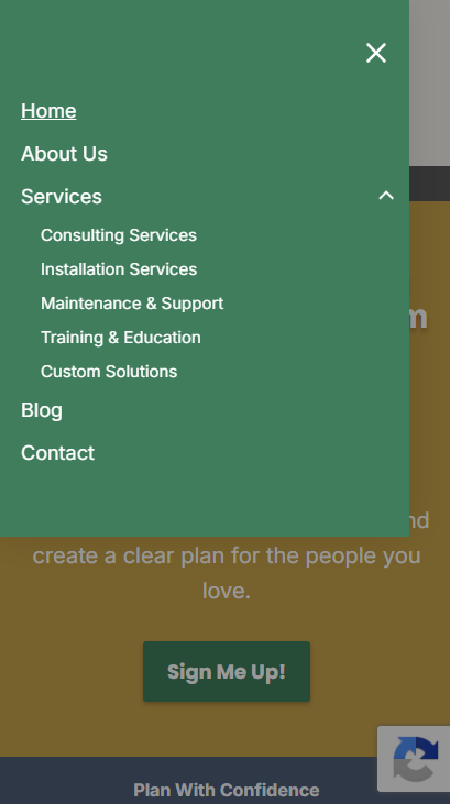
Simple Mobile Navigation
A navigation menu that works perfectly on desktop can become overwhelming on mobile.
Mobile visitors should be able to:
- Open the menu quickly
- View key pages immediately
- Access the primary CTA easily
- Expand dropdowns without confusion
If users cannot find information within a few seconds on mobile, many will leave the website entirely. Mobile-first navigation has become a critical part of modern website planning.
Navigation Should Support the User Journey
Good navigation is not just about menus. It is about helping visitors move naturally through the website from the home page to scheduling the consultation.
Every navigation decision should support that journey. Visitors should never feel lost or unsure about what to do next.
Why Navigation Planning Should Start With Wireframes
One of the biggest mistakes businesses make is designing navigation after development has already started.
A better approach is to plan navigation during the wireframing stage.
Website wireframes help map:
- Navigation hierarchy
- Dropdown structures
- User journeys
- CTA placement
- Content organization
By planning these elements early, businesses can identify usability issues before investing in development.
You can learn more about this process in our website wireframe guide.
How WP Minds Plans Website Navigation Structures
At WP Minds, we approach website navigation as part of the overall website strategy.
Before development begins, we work through:
- Information architecture
- User journeys
- Content hierarchy
- Conversion pathways
- Mobile navigation planning
This helps ensure that every page has a purpose and every navigation element supports business goals.
Whether we are building a law firm website, a membership platform, a healthcare website or a custom WordPress solution, our goal remains the same:
Create a website that feels effortless to use.
Our WordPress development team builds websites with navigation structures designed around usability, SEO, and conversions rather than simply aesthetics.
Pro Tip: Every Menu Item Should Earn Its Place
One exercise we often use when planning website navigation is asking:
“Would conversions decrease if we removed this menu item?”
If the answer is no, it may not belong in the primary navigation. Many websites include pages that attract almost no clicks but create unnecessary clutter. The strongest navigation menus are often the shortest.
Final Thoughts
The best website navigation structure is not the most creative.
It is the easiest to use.
Visitors should immediately understand:
- What your business does
- Where they can find information
- What action they should take next
Clear navigation creates a better user experience, supports SEO, and improves conversions.
If you are planning a new website or redesigning an existing one, start with the structure first. Navigation decisions made early can have a major impact on how effectively your website performs long after launch.
Need Help Planning Your Website Structure?
At WP Minds, we help businesses create user-focused website structures, strategic wireframes, and custom WordPress websites built around conversions.
Whether you need help planning your website architecture or developing a custom WordPress website, our team can help you create a navigation structure that is simple, scalable, and designed for growth.
Also Read:
- Law Firm Website Design Tips to Attract More Clients
- Website Structure to Take You From 0 to 1K Plus Organic Website Traffic
- Website Development Consultancy: The Definitive Guide