
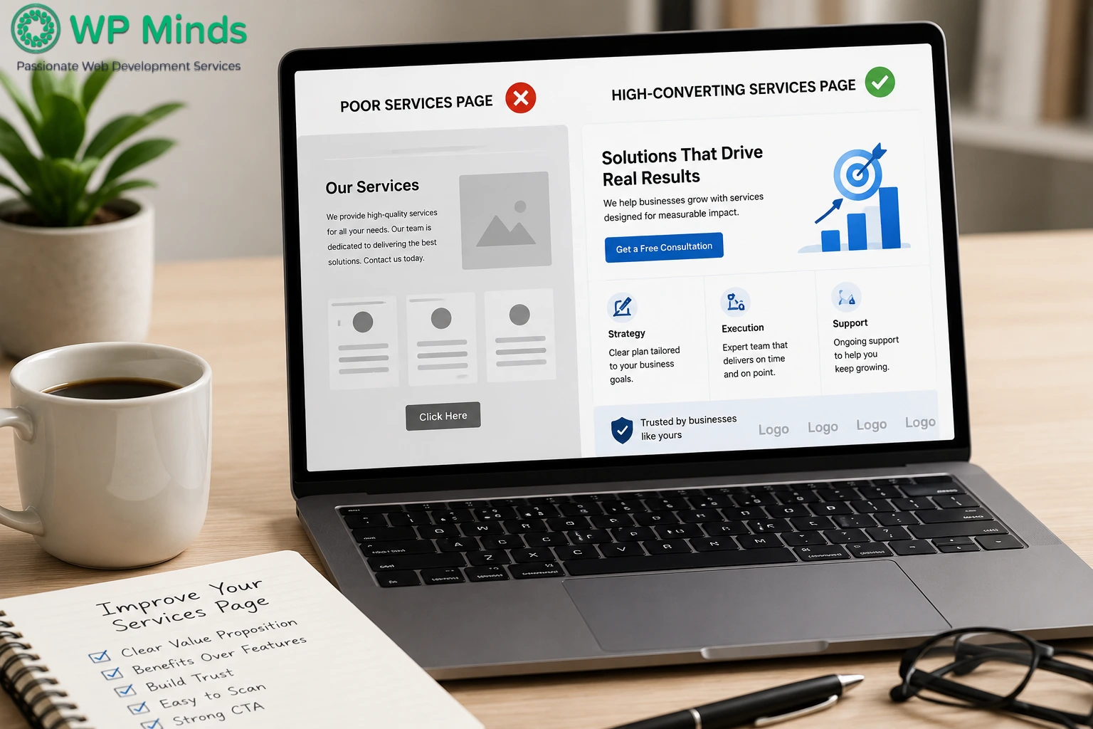
Why Most Service Pages Fail (And How to Fix Yours)


A services page has one important job: help the right visitor feel confident enough to take the next step. Yet many pages only describe the company, list deliverables and end with a contact button. The visitor must decide whether the service fits their problem.
That gap is why a polished page can still produce few inquiries. The problem is rarely one missing section or an outdated color scheme. It is usually a mix of unclear positioning, weak content, friction and technical issues.
If you want to see real-world examples of service pages and the features they use, explore our service page examples. This guide focuses on why services pages underperform and how to fix them.
Read More: How to Create High-Converting Landing Pages
1. The Page Leads With the Company, Not the Customer
Many service pages open with company history, jargon or a claim such as “We provide innovative solutions.” That does not confirm whether the visitor is in the right place.
People arrive with practical questions:
- Can you solve this problem?
- Is the service right for me?
- What result and next step can I expect?
State who the service is for, the problem it solves and the outcome it supports. Then provide one clear action.
“We build fast WordPress websites” describes an activity. “We help service businesses turn outdated WordPress sites into fast lead-generation tools” connects it to a result.
A documented website strategy makes this easier. It gives the page a defined audience, goal and role within the wider customer journey.
2. Several Services Compete on One Generic Page
An overview page supports discovery, but it should not sell every offer in detail. Visitors comparing web consulting, development and speed optimization have different concerns.
Create a dedicated page when a service has its own search intent, audience, process, benefits or proof. Let the overview introduce and link to each offer.
Do not duplicate the same copy and swap the service name. Google recommends helpful, reliable, people-first content. Each page should answer questions about that specific service.
A service website template may keep elements consistent, but the copy must reflect the buyer’s situation. The best service page examples do not treat every offer as interchangeable.
3. The Copy Lists Features Without Explaining Their Value
“Custom design,” “responsive development,” and “SEO-friendly build” make visitors translate technical work into personal value.
Connect each feature to its practical effect:
- Custom design helps your business look credible and distinct.
- Responsive development makes the page easier to use on smaller screens.
- Clear hierarchy helps visitors find answers without digging.
- Better performance reduces delays before people can interact.
Explain why each part of the service matters without making exaggerated promises. A website content strategy balances customer problems, business goals and decision-making information.
4. The Claims Feel Too Broad to Trust
Phrases such as “best-in-class” and “unmatched quality” appear everywhere. Without evidence, they add noise.
Replace broad claims with relevant proof:
- A client result with context
- A testimonial naming the problem and outcome
- A relevant portfolio example
- Specific experience, credentials or guarantees
Place proof near the claim it supports. For speed, show before-and-after data. For a smoother project, explain how feedback and approvals work.
Teams often ask, “Does our service page design look modern?” A better question is whether the page makes its promise believable. Attractive presentation helps, but credibility supports action.
Stanford’s research included more than 4,500 people and identified factors such as expertise, evidence, clear contact information, professional design, usability and updated content as contributors to website credibility.
Source: Stanford Web Credibility Research
5. The CTA Asks for Too Much, Too Soon
A single “Contact Us” button asks every visitor to take the same leap. Others may still need information about pricing, timing, fit or risk.
Choose one primary action. “Schedule a strategy call,” “Request a website audit,” or “Get a project estimate” tells visitors what happens next.
A case study, checklist or guide can help people who are not ready for a call. Keep the primary CTA consistent and repeat it after key decision points.
Too many CTAs create hesitation. WP Minds’ website conversion guide explains how messaging, user experience and calls to action work together.
6. The Page Creates Unnecessary Friction
Long forms, hidden contact details, vague buttons, intrusive pop-ups and unexplained calendars can delay a decision.
Ask only for information needed for the next conversation. Explain what happens after submission and when to expect a response.
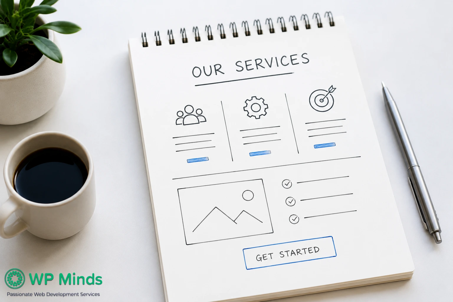
A services page layout should guide attention. Before redesigning, map the content and actions through website wireframe creation. This exposes distractions before design begins.
You do not need a complicated service website template. Make the next step visible, specific and easy to complete.
7. The Page Is Hard to Scan
Visitors rarely read every word in order. Research on how people read online shows that they mainly scan pages.
Research based on five eye-tracking studies, found that people typically scan online content rather than read every word. This reinforces the need for clear headings, short paragraphs and easy-to-find information on a services page.
Source: Nielsen Norman Group
Use descriptive headings, short paragraphs, selective bullets and clear labels. Put useful information first and remove introductions that delay the answer.
Good service page design supports the content. The services page layout should reveal the message, proof and next step. When reviewing our services examples, study how quickly you understand the offer.
8. Slow Performance Undermines the Message
A page cannot persuade if it loads slowly, shifts while someone reads or works poorly on mobile. Large images, scripts, animation and plugins often cause these problems.
Google’s Core Web Vitals measure loading, responsiveness and visual stability. Test both mobile and desktop. Compress images, remove unused assets and improve caching.
If technical improvements fall outside your team’s experience, a WordPress speed optimization service can identify and fix the underlying bottlenecks.
9. The Page Is Published and Then Forgotten
Service pages are often treated as finished assets. Buyer questions change, offers evolve and weak points appear in performance data.
Define success before making changes. Track qualified forms, booked calls, phone clicks and other meaningful actions. Then review:
- Which searches and campaigns bring visitors?
- Where do people leave?
- Which CTA receives clicks?
- Do inquiries match the intended service?
When traffic allows, test one important element at a time. A practical website optimization process helps the page improve over time.
Also Read: Landing Page Design Best Practices That Actually Convert
A Better Way to Fix Your Services Page
Do not begin by choosing another service website template or collecting more service page examples. Diagnose the page first.
Start with these five checks:
- Intent: Does the page solve the problem visitors expected to find?
- Clarity: Can someone explain the offer after scanning the first screen?
- Confidence: Is every major promise supported by relevant proof?
- Action: Is the next step specific, visible and proportionate?
- Performance: Does the page work quickly and smoothly on mobile?
The issue may be strategic, not visual. Searching “our services examples” or asking whether our service page design looks current may inspire ideas. It cannot replace research, positioning or measurement.
WP Minds offers website consulting services to identify gaps and create an improvement plan. For a broader rebuild, professional WordPress design and development can unite strategy, content, user experience and technical work.
Is Your Services Page Costing You Leads?
Conclusion
The goal is not to create a longer services page. It is to remove uncertainty at every stage of the visitor’s decision. A strong services page clearly explains who the service is for, what problem it solves, why visitors should trust the offer and what they should do next.
Review your services page regularly using these principles, then improve the areas that create the most friction. When the message, proof, user experience and performance work together, the page becomes more than a list of services. It becomes a useful part of your customer journey.
Visitors should understand the offer, trust the promise and know what to do next.
More Related Blogs:
- How to Create a Website Homepage – A Step by Step Guide
- 10 Best One Page Website Examples That Work
- 7 Best About Me Page Examples Including Key Features
FAQs (Frequently Asked Questions)
How to Fix a Page That Is Not Working
Test the page in a private browser window, clear the cache and check the URL. Then review plugin conflicts, updates, form delivery, console errors and hosting logs. Back up the site before making changes. Ask a WordPress developer to diagnose any unresolved issues.
Why Is My Service Page Getting Traffic but No Leads?
The traffic may not match the offer or the page may not build enough confidence. Review the search terms, opening message, proof, CTA, form, mobile experience and speed. Track qualified inquiries instead of traffic alone.
Should Every Service Have Its Own Dedicated Page?
Create a dedicated page when a service has distinct search intent, benefits, processes, proof or audiences. Closely related minor services can remain together. Use a main services page to summarize and link to each detailed offer.
Where Should I Place CTAs on a Service Page?
Place the primary CTA near the top, after key proof or benefit sections and near the end. Repeat the same action instead of presenting competing offers. A mobile-friendly sticky CTA can also help if it does not block the content.
What Sections Should a Website Service Page Include?
Include a clear promise, the customer’s problem, the service outcome, benefits, process, proof, FAQs and next step. Add pricing guidance, deliverables or fit criteria when useful. Let your buyers’ questions determine the final sections.
How Do You Structure a Service Page?
Move the visitor from recognizing their problem to making a decision. Start with the problem and desired outcome. Explain the service, support your claims with proof, reduce risk and present the next step. Test the flow with a wireframe before the design begins.

Popular Guides
View All Guides